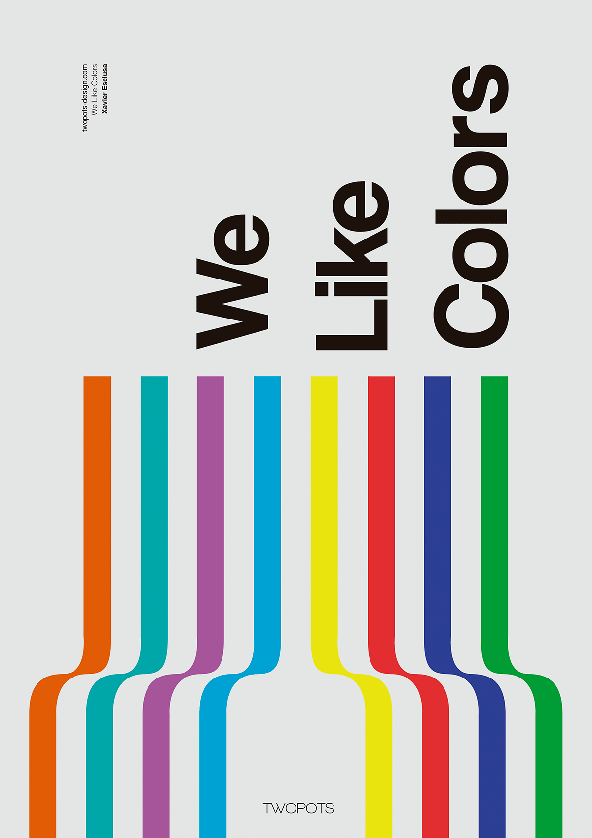
1. This poster is designed by Xavier Esclusa Trais, He used many color to convey the meaning of this poster-we like colors. He used simple lines and curves to create a unique visual effect. The first thing that attracted me to this poster was the colors he used, and the following is attracted is the words. This poster was designed very good and very clear to express the point he wanted to make.

2. This website's cover is designed by Awd Agency, and she is from Italy. The size and scale of the cover is using perfectly, the word "discover" combine with the woman can create the very unique and balance background. The red object prominent and draw a lot of attention on the dark background. Even the two colors are totally opposite but they balance perfectly. And it'e easily to see what is this cover about.

3. This poster is designed by Rebecca Nolte. This poster is designer for the Moma's 2013 exhibition. Typeface hierarchies play an very important role in graphic design, changing the size of the typeface can change the people more understand in this poster. The first thing that attack me is the large "M" almost cover all the background. It's used bright color to contrast with the other elements. And it's related to the main idea - Moma. All other elements in this poster they balance perfectly. The size and position of the typeface and content it's easily to understand what is this poster about.

2. This website's cover is designed by Awd Agency, and she is from Italy. The size and scale of the cover is using perfectly, the word "discover" combine with the woman can create the very unique and balance background. The red object prominent and draw a lot of attention on the dark background. Even the two colors are totally opposite but they balance perfectly. And it'e easily to see what is this cover about.

3. This poster is designed by Rebecca Nolte. This poster is designer for the Moma's 2013 exhibition. Typeface hierarchies play an very important role in graphic design, changing the size of the typeface can change the people more understand in this poster. The first thing that attack me is the large "M" almost cover all the background. It's used bright color to contrast with the other elements. And it's related to the main idea - Moma. All other elements in this poster they balance perfectly. The size and position of the typeface and content it's easily to understand what is this poster about.