2019年4月4日星期四

Color / Time and Space

1970 America


                                                                          Vintage


Renaissance Art period


pet color


2019年3月19日星期二

Hierarchy Samples


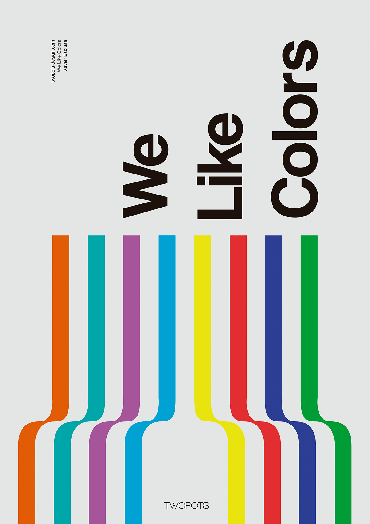
1. This poster is designed by Xavier Esclusa Trais, He used many color to convey the meaning of this poster-we like colors. He used simple lines and curves to create a unique visual effect. The first thing that attracted me to this poster was the colors he used, and the following is attracted is the words. This poster was designed very good and very clear to express the point he wanted to make.

14-Visual-Hierarchy-Principles-Every-Non-Designer-Needs-to-Know-Color-and-contrast-draw-attention-and-create-harmony-2

2. This website's cover is designed by Awd Agency, and she is from Italy. The size and scale of the cover is using perfectly, the word "discover" combine with the woman can create the very unique and balance background. The red object prominent and draw a lot of attention on the dark background. Even the two colors are totally opposite but they balance perfectly. And it'e easily to see what is this cover about.

typographic hierarchy 12 visual hierarchy principles every non-designer needs to know

3. This poster is designed by Rebecca Nolte. This poster is designer for the Moma's 2013 exhibition. Typeface hierarchies play an very important role in graphic design, changing the size of the typeface can change the people more understand in this poster. The first thing that attack me is the large "M" almost cover all the background. It's used bright color to contrast with the other elements. And it's related to the main idea - Moma. All other elements in this poster they balance perfectly. The size and position of the typeface and content it's easily to understand what is this poster about.

2019年1月29日星期二

Three designs I like

“wechat”的图片搜索结果

  Wechat is the most famous and required apps in Chinese youth generation. It's provide many function including chatting (video chat), paying bills and reading all kinds of news everyday. It's design by XiaoLong Zhao and the original intention are "Prudence, Elegance and Foresight". I like the color of this brand, they use green and white, it's present the idea of not too dull but very simple and obvious. Also the designer add English"WeChat" to guild to people and explain the app. It's showing the original intention, "Elegance" and "Foresight".


                    â€œstarbucks logo design”的图片搜索结果
  Starbucks is my favorite brand of coffee. The Logo of Starbucks is design by Terry Heckler. When people talk about Coffee I always think of Starbucks. It's everywhere and the logo is obvious and clear. The typeface is using the color of white, the image in the middle is using black, and the background and main color is using green. The combination of these three color it easy to catch attention of people. And the images is related to the typeface. "Starbuck" having two stars in the side of the logo make it more interesting and iconic.


                              Paul Shipper Avengers Infinity War Poster

  Avengers Infinity War is my most favorite movie in 2018, the poster is design by Paul shipper. This poster is very colorful and all the iconic characters are showing in the poster.The use of color and image attracts the attention of the audience, the color is related to the stone's color in the movie, this is make the poster more beautiful and interesting. And the large typeface "A" representing the film which is placed in the middle of the poster, The typeface highlight for the audience to understand and know what the film is about. Also the image has a lot of hints of high technology in it, and the background is the like an image of universe. I like it because I think this poster is not only for propaganda of the movie, it's also a successful form of Marvel Company.